By Janus Boye

Caroline Jarrett is an expert on forms and hosted a recent member call on the topic
Although most of us have to fill in too many forms, we rarely have a chance to look at the forms that our own organisation offers to users in a thorough way to find suggestions for improvements.
In a recent member call, Caroline Jarrett took us through her process for expert reviews of forms, with some of her top tips for making them easier to use and more effective. As Caroline simply said:
“The outside world sees you through forms”
Caroline is an expert on forms and is co-author of “Forms that work: Designing web forms for usability”.
We started by trying something simple as paying for a parking ticket. As it turned out, also among the call participants, we look at forms quite differently.
When do you see the page with the form?
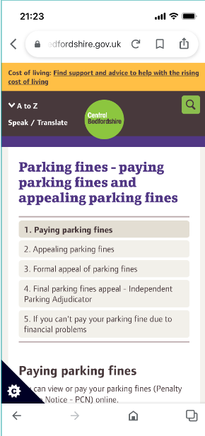
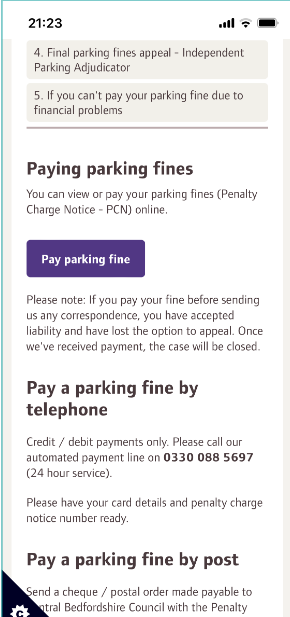
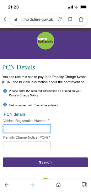
To illustrate her points, Caroline opened the call, by taking us through trying to pay for a parking ticket on the website of Central Bedfordshire where she lives. A simple routine and common task one should think.
She asked us all to use the ‘raise hand’ feature on Teams and then only lower the hand when we saw the page with the form.
Click on the below links to see the different pages on the journey and consider when you see the page with the form:
Summarising the journey, Caroline stopped to focus on three of them as shown below.

Before moving onto Caroline’s point of ‘we know a form when we see it’, there was also some good commentary in the chat on the wording throughout this journey. Penalty Charge Notice, shortened PCN on page 5. As one member pointed out, “Why can’t governments just use accessible language?”.
Another member called this lazy design and elaborated:
Thoughtfulness should be a part of every corporate culture. This is just one of the countless example of people not thinking about how something they designed really feels to the users. Often, if you raise these "small" inconsistencies you will be labeled as too picky but, this type of stuff really multiplies quite a lot and becomes a real issue to the users.
We know a form when we see it
Using the example from Central Bedfordshire, Caroline reminded us that we know a form when we see it. It’s a form when these three things happen::
Looks like a form and works like a form (Interaction design)
Asks questions and expects answers (Content design)
Allows someone to achieve a goal (Service design)
A good form needs a lot of design as Caroline said. Pointing back to the example from earlier, Caroline noted that the buttons on page 4 and 5 are different (narrow vs. wide). In terms of content design, she also mentioned the difference in wording, that some of the detail-oriented members had already noticed in the chat. On page 4 it said ‘Parking fine’ while on page 5 it said ‘PCN’.
It’s not good when names keep changing and these are indeed small details that will confuse the users.
This is when she referenced Tim Paul, head of interaction design at the UK Government Digital Service, and said that the the outside world sees you through your forms.
Tim originally shared the below diagram on Twitter in 2021 to illustrate how the forms are where the outside world meets your organisation.

A diagram illustrating how an organisation’s forms are just the tips of a much larger structure, ‘The service’ – most of which is buried inside the organisation itself. By Tim Paul
We can make forms better
According to Caroline, the biggest problem with many forms is that organisations ask for fields they don’t need. To quote:
A good form starts with user and business needs
It sounds so simple, but to elaborate, Caroline said that a good form is good in three ways:
Easy to read and to use
Easy to understand and answer
Easy to get it done and move on
Many forms are indeed never tested according to Caroline, and she also advised to write a short story about why people are using your form. There can be many different stories about parking tickets and understanding these can help you make the form and the entire experience so much better.
Caroline shared three steps to improving your forms:
Step 1: Be realistic about yourself and your users. Be explicit is the key here. Say exactly who you are going to be when you try the form and think about how that person is different from you in real life
Step 2: Use the form as the person in your story. Be honest at this step. If you get to a question where you don’t know the answer, make a note of that and if you hit any other difficulty, make a note of that
Step 3: Go back and think about the three layers. Is it easy to read, easy to understand and easy to get it done?
In closing, Caroline said that an expert review of your forms is certainly better than no review at all, but even better is real user testing. The expert might not be among your actual users and if you can make improvements alongside user testing, you’ll quickly make your forms much better.
Learn more about forms
Effortmark is Caroline Jarrett's consultancy business. On the Effortmark website, you’ll find much more about better forms and surveys. Caroline is also the co-author of Forms that Work: Designing Web Forms for Usability and of User Interface Design and Evaluation. Finally, Caroline also hosted a popular member call on creating an effective survey earlier this year.
You can also browse the slides (PPT) or lean back and enjoy the recording from the call.